Yahoo Article Pages Consolidation
Unifying different article experiences and layout
Background and challenges
By 2022, Yahoo’s article pages had undergone numerous experiments, resulting in significant inconsistencies across visual design and user journey. Frequent shifts in company strategy, along with changes in product managers and designers, led to fragmented experiences that lacked a unified direction.
Article pages is one of the most visited pages on Yahoo averaging around 400M Daily Active Users. Despite its high traffic, the page had a lot of inconsistencies resulting in broken user experience.
And since Yahoo News functions as a central hub, aggregating stories from a wide range of third-party publishers. As a result, the platform hosts highly varied content—from articles with no lead images, to video-only stories, to pieces with minimal supporting text. The new layout needed to be flexible enough to accommodate this diversity of content while maintaining a consistent and seamless reading experience.
The process
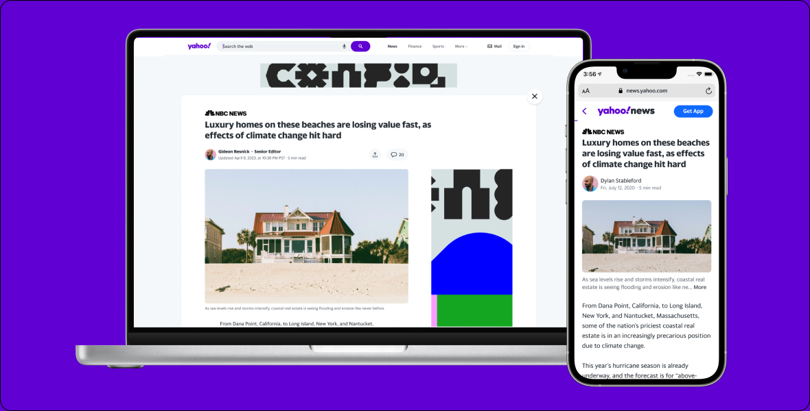
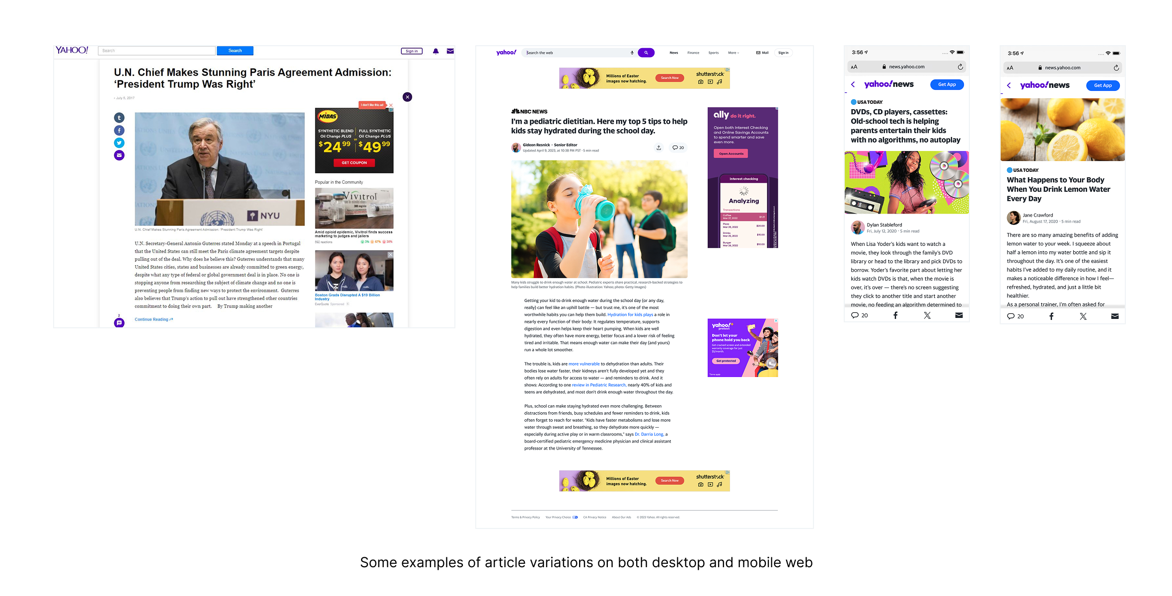
Audit all article experiences and layout on both desktop and mobile web
I went ahead and do a quick audit for both desktop and mobile experiences and found several inconsistencies such as:
- Various advertisement unit placement
- Different visuals for share and social button
- Presence of close button vs not
- Different lead images sizes
Background
As part of a major company initiative, I led the effort to modernize and streamline Yahoo News article pages, which had become cluttered and visually inconsistent over time. The lack of a centralized layout led to a fragmented user experience and limited scalability. By consolidating the design into a single, cohesive system, we resolved years of UI debt, refreshed the outdated aesthetic, and created a flexible foundation for rapid iteration and future enhancements.
My role
1 Lead designer (me)
1 Art director
1 Lead product manager
1 Engineering lead
1 User research
The outcome
The article page consolidation significantly enhanced the user experience, leading to a 60% increase in page views, a 14% lift in average revenue per daily active user, and a 59% boost in time spent on article pages. Internally, the unified design system improved cross-functional efficiency between engineering and design teams by 3×, enabling faster implementation and iteration.
Identify and tackle key areas
After I captured all the variations of the entire landscape, I then started to group the areas of problem together and then identify the key areas to tackle first. I notice there are lot og moving pieces and little changes we can do to improve it but before I go further, I would like to discuss several things with the product team, to make sure that all stakeholders are on the same page.
This phase is crucial to be discussed with the product manager as being on the same page of tackling a goal is very important in shipping the project on time successfully. Also as a squad, we like to involve every team function early in the process to eliminate confusion later down the road. In this phase, our engineering partner is also in the discussion.
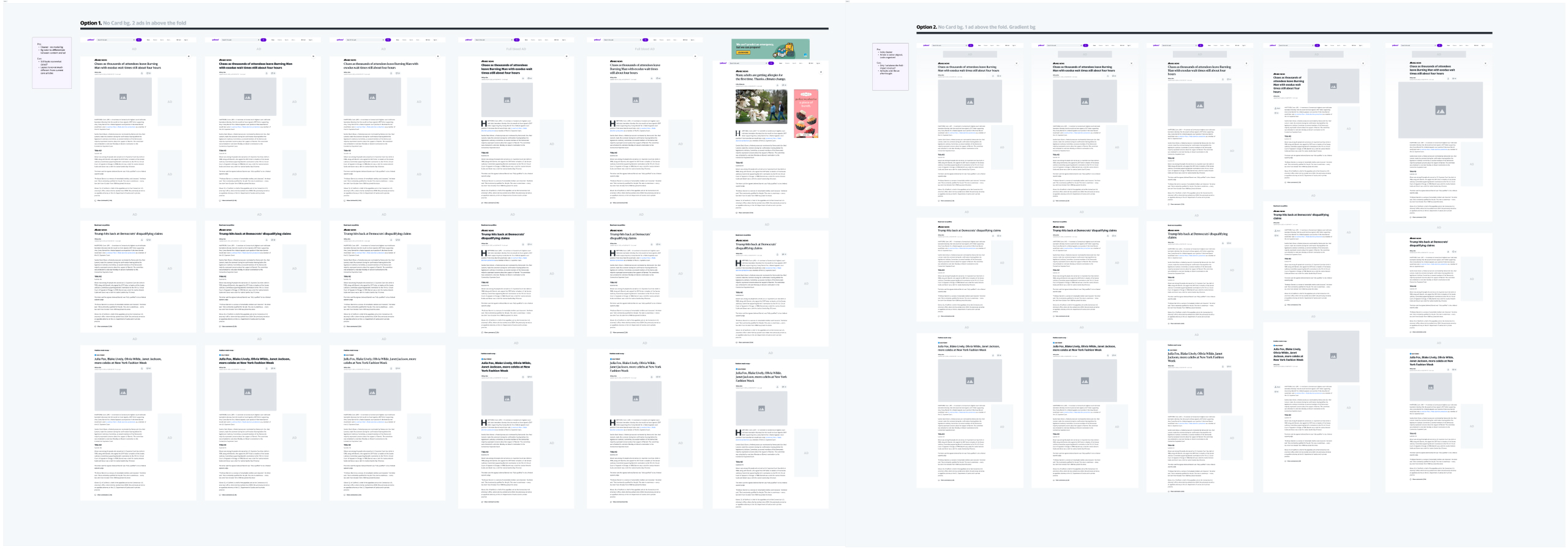

Start design explorations and narrow down
The design exploration kicks off with the goal of addressing the various issues that we discussed in the earlier process. I sketched and mocked up design possibilities tackling different issues and the possibility is endless. To narrow it down, I brought in the design director, PM, and lead engineer to assess each concept and narrowed it down to several concepts targeting key issues.
Rolling it out and iterate, but it’s not smooth sailing ...
Due to the tight timeline to achieve the squad’s goal, the team decided to roll it out in phases. We did 1% bucket, monitor the metrics and then iterate from there. The goal is to have a neutral or positive revenue while maintaining engagement and reading experience. During the roll out, 2 problems arose from the design that’s chosen and the team had to pivot quickly to solve it. The problems were:
Problem 1: Image first layout
First, having to put the image first and article title later make the page looks less like an article. We originally decided this order to create a more premium looking page by having a visual first, turned out it didn’t work well because images we ingested from third party publishers are not great.
Problem 2: Close button removal
Eliminating close button helped create a cleaner look but it did hurt the traffic back to homepage which result in declining time spent per user.

Conclusion & learnings
Working on a broad project like creating a united layout for articles in a short period of time requires the team to be nimble. Some of the strategies that I think as a designer can help the process were:
- Understanding the success of the project: What are the metrics we want to measure to define success? What is success like for this consolidation?
- Asking a lot of strategic questions: As a designer, it is easy to want to change a lot of things when you see a lot of elements that are not working together . Being mindful about the strategy and timeline will help narrow down design explorations and decisions.
- Sometimes the job doesn’t stop at making things look pretty: At the beginning of the project, it is very easy to want to design visually compelling designs while not considering other limitations like ad units and image sourcing. While it might work for 20% of the use cases, in reality, there’s another 80% use cases that limit the design to be all visually compelling.
At the end of the day, it is very rewarding to have worked with a small yet talented team of product manager, engineers, business development and other partners across the company at such a speed and be able to exceed the metrics we want to maintain.
